THE CHALLENGE —
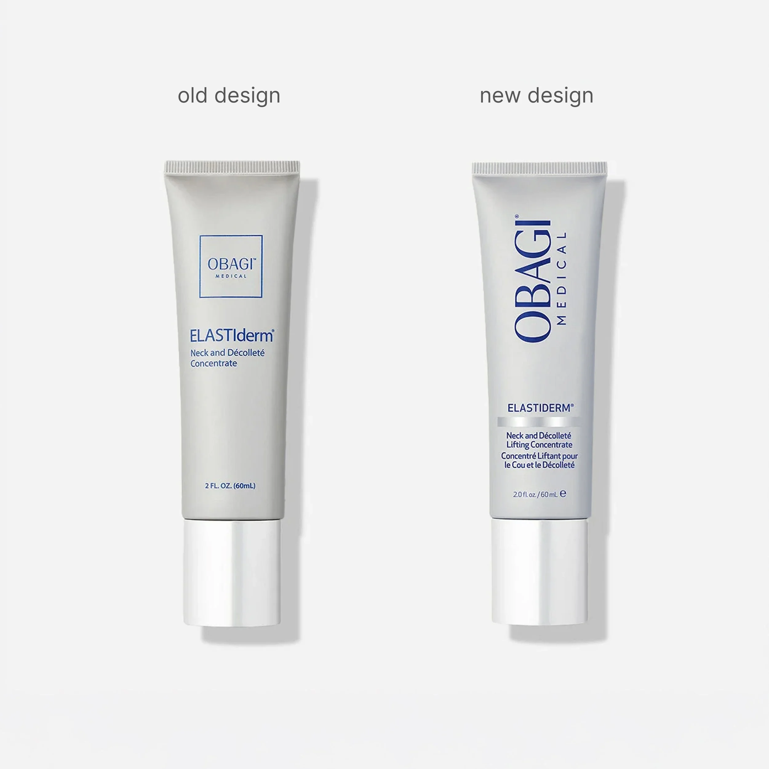
Obagi brand has been around since the 1980s — and over the decades, the logo and packaging design grew in every direction with barely any consistency. The goal was to bring it all back to one and to build a navigation system that could scale consistently for more than 100+ SKUs of the brand.
We build a system that made the range intuitive to shop — establishing a hierarchy of brand, product family, function, and color-coded bar for easier navigation.

Old Design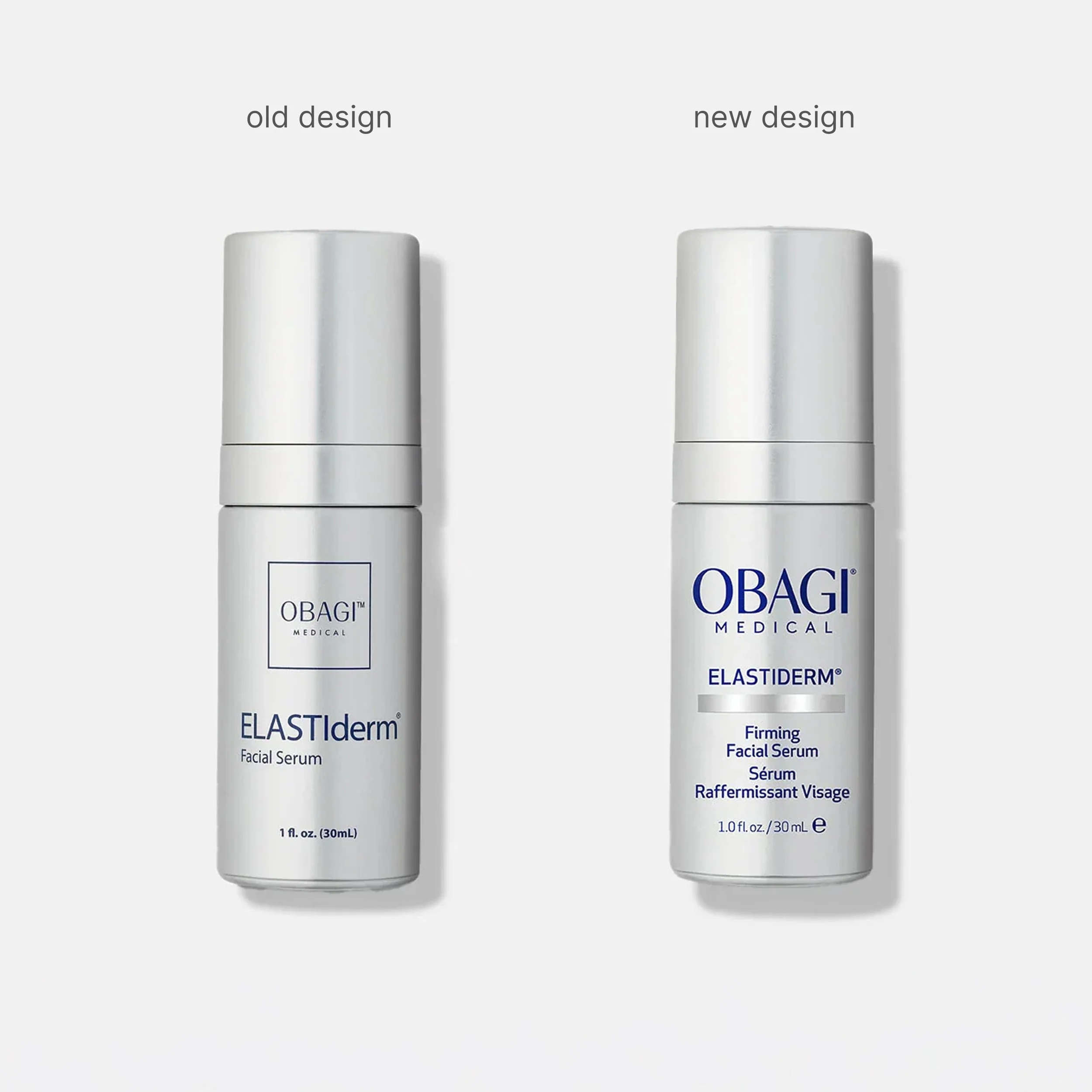
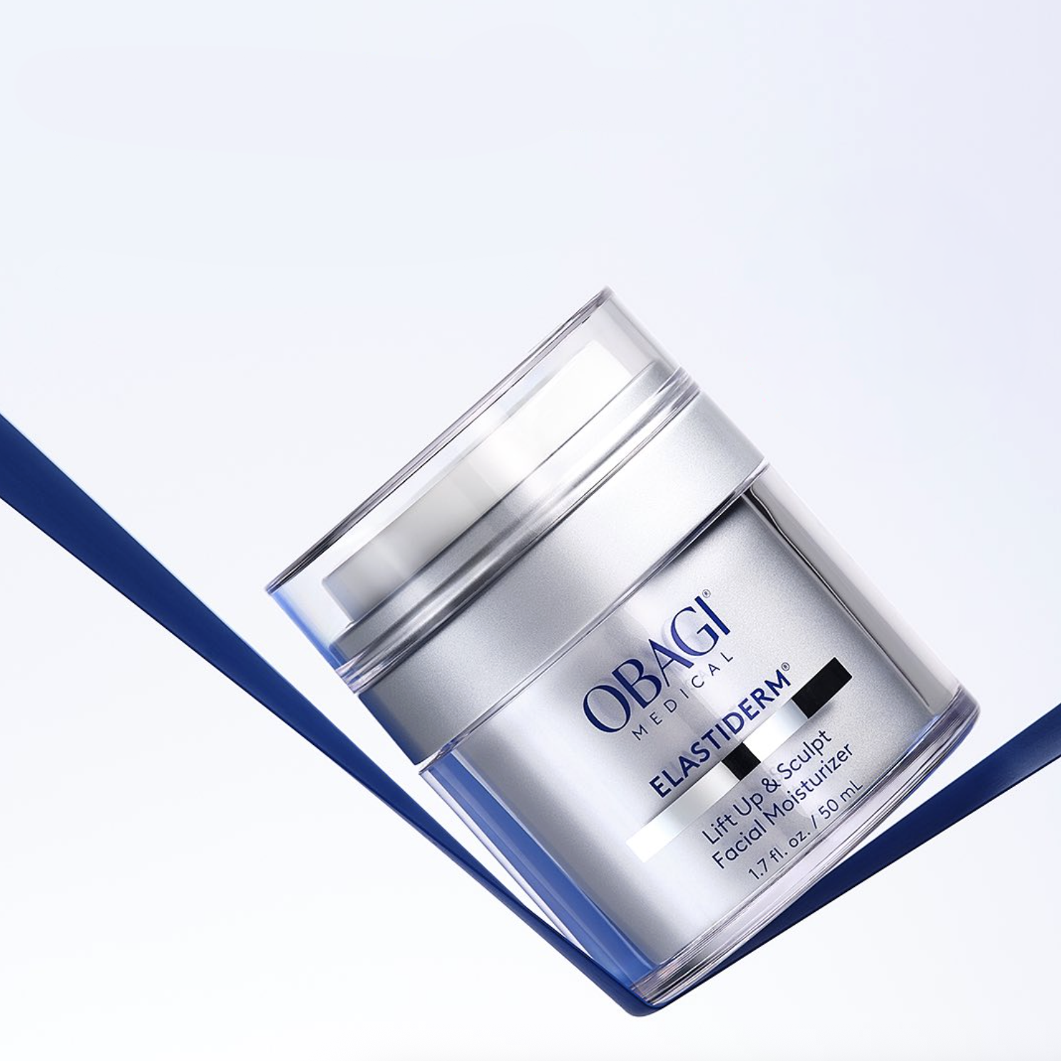

Elastiderm was the first collection to come to life under the new system, featuring bold brand lockup, clear product grouping, and a color-coded metallic bar that elegantly separates functional information.
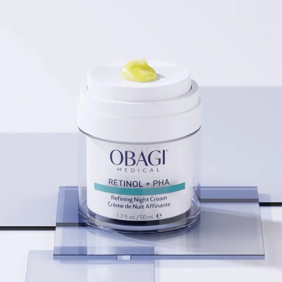
When Obagi's latest innovation launched, it rolled seamlessly into the same framework — proving that the system doesn't just work for one collection, but as the foundation for the brand's future.

My Role —

Creative Direction for Packaging Redesign
New Design